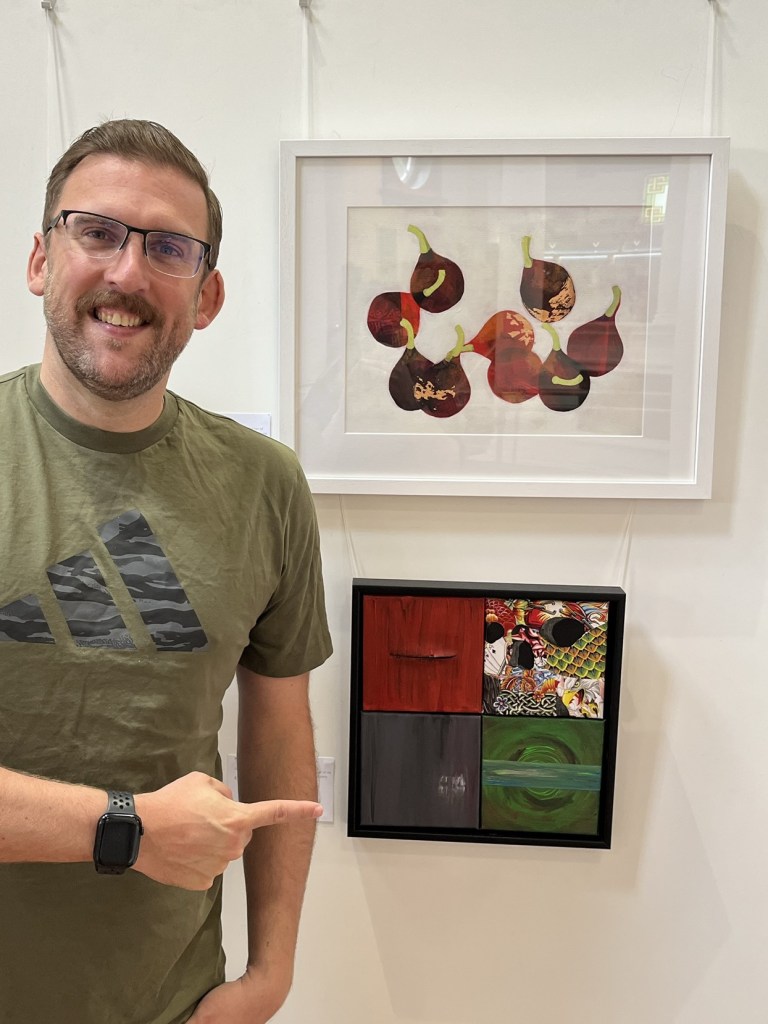
I am very pleased to have a piece in this year’s Summer Exhibition at The Horton. The Horton is an arts centre and cafe where I go for regular life drawing classes and it’s also a very nice building – a converted chapel in the former Epsom cluster of psychiatric hospitals.
The theme for their summer exhibition is the Music of Life. Music is a very personal thing to me. Growing up, I didn’t really understand why everyone was obsessed with music. Then, one Monday night when I was 15, I stayed up late and watched Headbanger’s Ball on MTV. The show was an album launch special for Roots by Sepultura. Sepultura are a band from Brazil and this album mixed traditional Brazilian musical influences with heavy metal and it blew my mind. Before this, all I had ever heard was chart and pop music which I didn’t really get it, it was all just ubiquitous background music to me. It turned out that I’d never heard anything that moved me.
This kicked off my musical journey and lead me down a path into sub-genres of heavy metal where I discovered that what I really liked was metal which an extra layer to it such as groove metal or industrial metal – the sort of music no one else at school seemed to be listening to. I mainly liked aggressive or miserable music. Through most of my life, I’ve only had a handful of friends who like anything similar to the music I like, so music became a very personal thing to me because I would mainly listen to music by myself and it wasn’t a shared experience with anyone else.
When digital streaming arrived, I went through another musical revolution – I now had all music within my reach and went through a huge back catalogue of artists and albums I hadn’t heard there are only so many albums a man can buy. I also discovered new genres of music that I really liked, such as synthwave.
Back to the exhibition – I missed The Horton’s Summer Exhibition in 2024 because I didn’t realise it was happening, so had been looking forward to creating and submitting something this year. When the Music of Life theme was announced, I had to take a long hard think about what I would paint. The sort of music I like and the sort of feelings and emotions I associate with music can’t really be captured by a nice painting of a man playing a trumpet. So I figured I would need to do something abstract to capture how I think and feel when I listen to the music I love.
You could submit up to 3 works for the exhibition, so started planning paintings for different genres and then pick my favourite three for submission. Using small, square canvases to make the images feel like the CD covers i grew up with and I came up with the following. I’ve embedded Instagram links for this, so you can also listen to an example of the music for each one if you click through to Instagram. Hey, give me a follow whilst you’re there!
Industrial
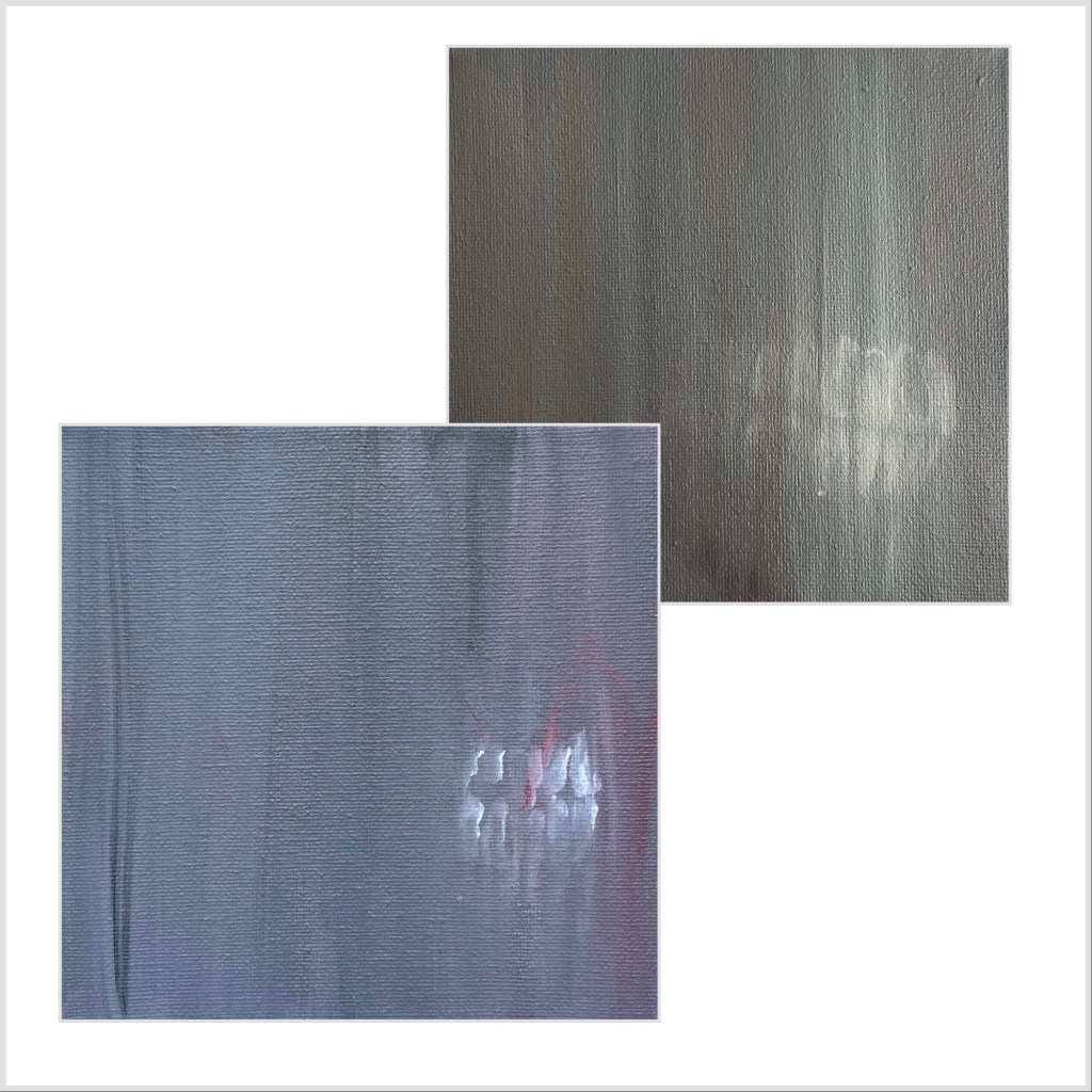
I wanted this to look grimy and inspired by industrial architecture. I was already thinking about how I would do this when I got a train to Sheffield (for the Snooker World Championships, of all things ) and saw some old corrugated metal on the side of some buildings as we came into the city. It was exactly what I had been trying to think of. I also wanted to have something sinister in the image, so included the teeth. I wasn’t happy with the teeth in the first image below so kept going until I the teeth I liked.
Aggrotech
To me, this genre of music sounds aggressive, violent, bloody and raw. An offshoot of industrial music, it might be easier if you listen to the example to see what I mean. The stitched up slash on the painting wasn’t originally intended to look like a mouth, but I’m glad it does as a feature of the genre is harsh, distorted vocals.
Both of these images came out a lot more minimalist than I first envisioned, but I was very happy with them and felt they really did capture how this sort of music makes me think and feel.
Psychobilly
This a fast, heavy form of rockbilly and the scene around this genre is a lot more punk rock than the others genres explored so far. We had experimented with collage using magazines at The Horton in one of our life drawing classes, which I really enjoyed, so I wanted to incorporate that to make this image look like a cheap homemade fanzine or flyer.
I was originally thinking of making the image black and white, as if it had been photocopied for cheap mass distribution, but I eventually ended up using a book of 1000 tattoo designs that I found on eBay and I tried to pick out tattoos that fit the American rockabilly subculture. The collage is in the shape of a skull, which I intentionally made hard to recognise up close so it would dawn on the viewer from a distance. Step back from your screen and have another look.
I’m also happy that my music example above is by The Reverend Horton Heat, what with the exhibition being at The Horton.
Darksynth
Darksynth is an offshoot of the Synthwave electronic genre. Synthwave tries to capture the nostalgia of 80s culture in music, and darksynth has a more sinister sound inspired by horror movies and cyberpunk themes. I wanted to show the spooky side of the music through the glowing portal but constrast it with the structured nature of how that music is created by including the band across the middle to suggest tracks on a computer.
I’ll be honest, I’m not happy with this one! It didn’t really capture the ideas I had in my head and, looking at the in progress image below, I think it lost something whilst I was working on it, with the colours looking muddled and muted and the band not really working.

So why have I included it here? Whilst I was working on the images, I stacked them up to take the photo below and I had a moment of serendipity.

Straight away, I thought ‘Oh, that looks like when you create a Spotify playlist and it uses four song covers to create an image for the playlist”. I sold my CD and DVD collections a long time ago, so I only listen to music digitally nowadays. As I was trying to create something to represent my personal relationship with music, I knew immediately I needed to use all four paintings to make one image in the style of a playlist. If I was being pretentious, I would say that although I don’t like it, I’m including the green darksynth image as when you create a playlist on a music app you don’t get to decide what the album covers look like and you might not like all of them. In reality, I ran out of time to make a new painting before the submission deadline.
Deciding how I was going to arrange the four pieces was a big headache and I tried many, many combinations. Ideally, I wanted the red and green in opposite corners for contrast, and no matter where I put the psychobilly tattoos, it looked best on the top right. Eventually, I settled on the order below.
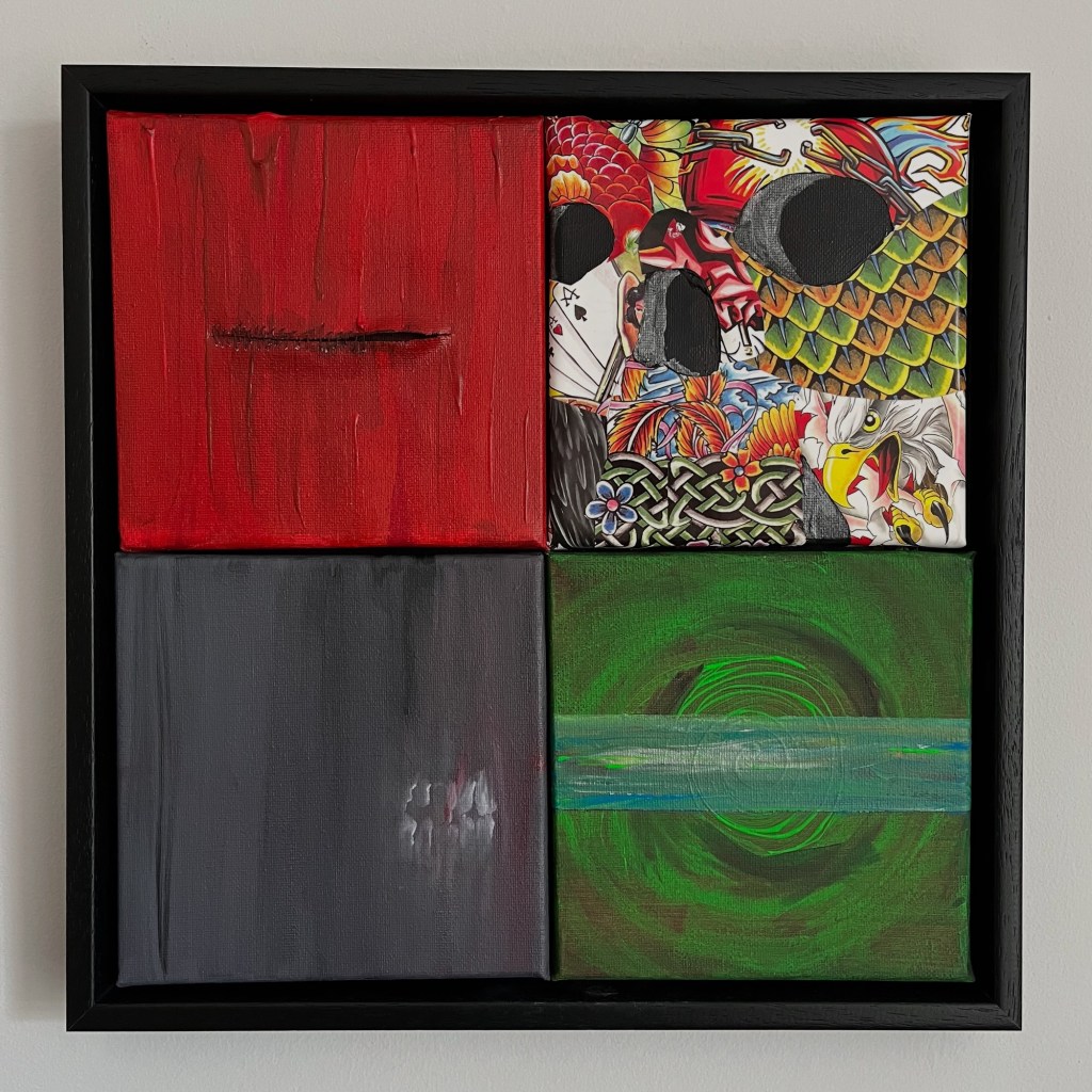
The final layout had another happy coincidence – aggrotech is an offshoot industrial music, so I like that the flow of paint is going in the same direction and the red appears to be bleeding into the industrial image despite the fact I had already put the hints of red in that painting before I decided all of the paintings were going to make one image.
Finally, I had to think of a name for the artwork and that was pretty easy – the sort of generic title that an app would create for you that is also strangely personal for a personal project like this: My Playlist.
If you have read all of this, thank you for sticking with it. I’m happy with the paintings, happy to be able to share the process with you and I’m also very happy to be included in an exhibition at The Horton, where I have been going to life drawing classes and rediscovering my love of creating art for the past few years.